
Jun 15, 2008
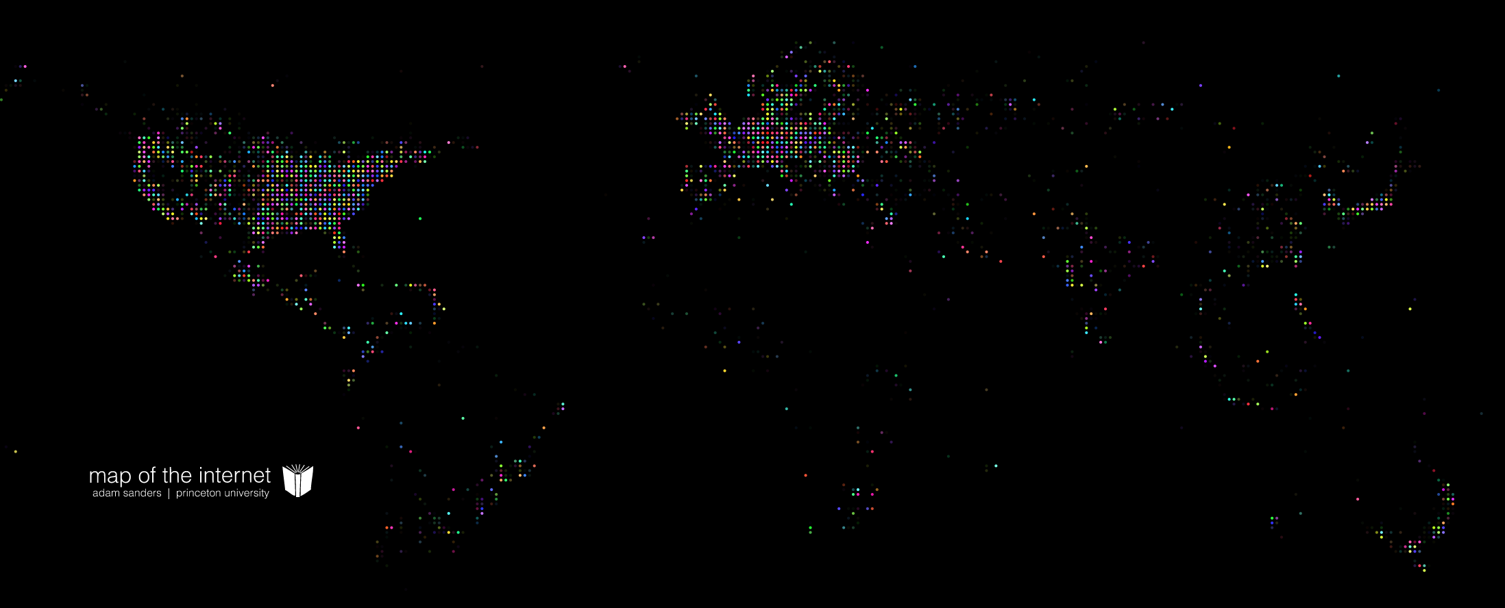
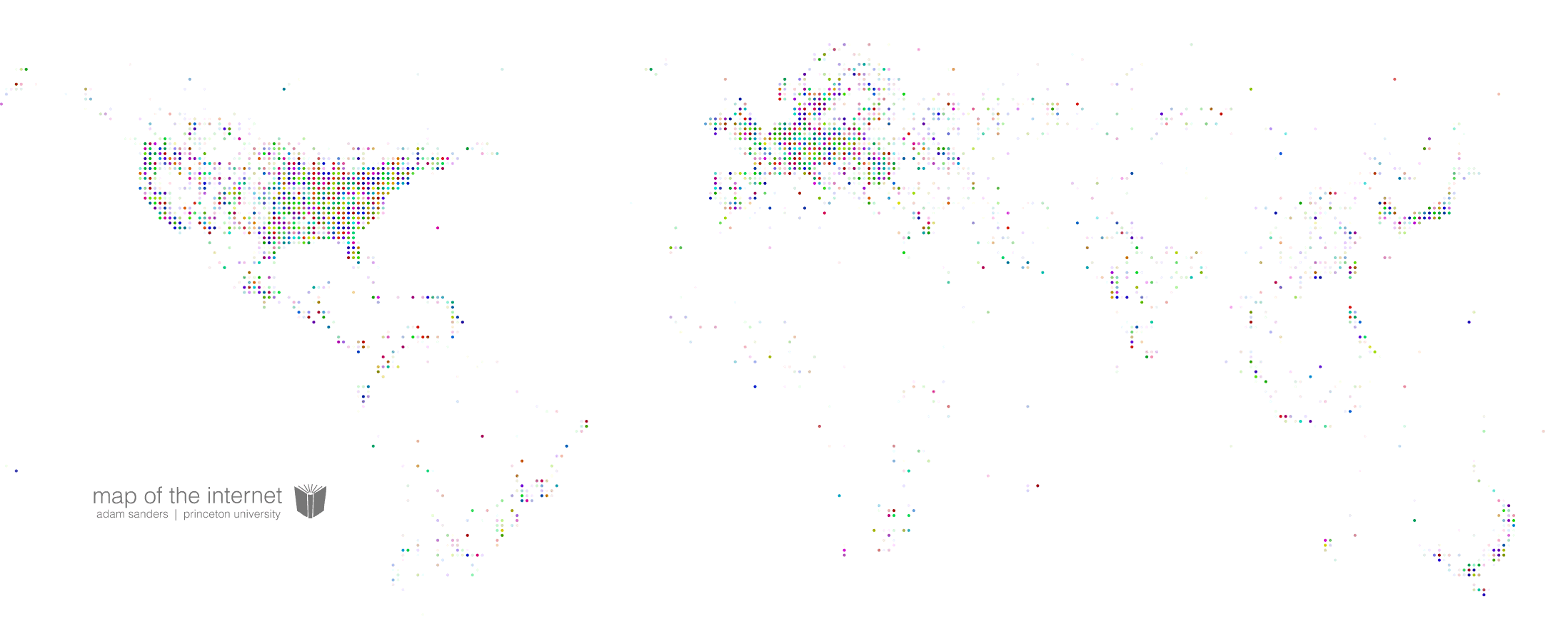
The charts at right show the relative density of IP addresses by geographic region. The data for this project was taken from netdimes.org. The original data set included several million IP address hits with their corresponding GPS coordinates. This data was parsed into a matrix and the geographic coordinates were then chunked into smaller regions. The relative intensity of each dot is representative of the number of IP addresses found in that region. The color of each dot was randomly selected.
Related files: 2
Related links:0
Internet Map
Map of the internet
Internet Map White
Map of the internet